Thursday, December 9, 2010

The transience of light is sometimes captured.


“Transience of light” - this is a great phrase and really was the goal of the impressionists: to capture the effect of true light in paint. Painting the quality of light in winter is my challenge for the next few months and I am jumping into my experiments with excitement. I use this term because all my work is experimental. Each picture is an infinite number of decisions and combinations never to be reformulated in the exact same way.

Composition may be copied – but tone, contrast and colour cannot be exactly duplicated. So each painting is a unique interpretation of an original idea. If somewhat successful, an impressionist style painting is a wonderful reflection of the transience of light that you can put on your wall. You and no one else possesses it. This, I think, is one of the great the allures of art. It is the allure for me as a painter, to make pictures, hopefully good ones, that have never been seen before, and can never be duplicated.


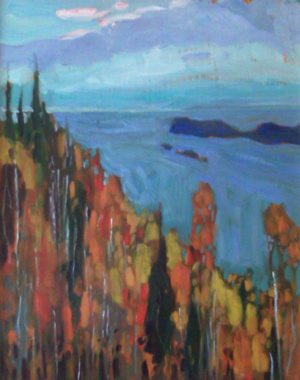
Painting light and shadow on snow – there is no guidebook to follow. Snow can be purple, pink, green, blue, yellow, orange - it does not matter and I have seen it painted successfully in all of these colours. It can be subtle, or it can be stark - it can be painted warm or cool.

The interpretations are limitless and so are the historical examples. I also have the benefit of photography - which also provides other clues and reference for the way light travels across the white surface. And I have the benefit of snow out my back door – I am looking at the sun weakly shinning through a silvery haze of fine snow. The ground is covered with a blanket of mauve and the trees in the distance the palest purple blue.

The snow is falling - it’s a great day to paint! 

Tuesday, November 2, 2010

It snowed yesterday - and that's good news.


A strange thing happens to us after the first snow - even if that's on Oct.30  - fall is over, winter begins. For me the requests for winter paintings start on the same day. Not that I don't like fall, but I have had a long a couple of months painting fall pictures and it's time for a change. I wanted to show one painting in particular - a picture of a windy fall day on Lake Superior. I tried to capture the scudding clouds and the bold white caps and deep blue water that you always see on these types of days. There is just a hint of orange in the cedar trees along the shore.


All of my fall canvases were the result of many sketches and here is a small portion of them. The subject matter comes from various travels - Kawarthas, Superior, Killarney.


And so, winter is now on the go... here are the first 2 paintings. Both are interesting in that they are of winter but the pallet is intentionally all very warm - pinks, purples, reds, and oranges. It is the management of the colour and of course the subject that provides the "cool" in these paintings.


Friday, September 24, 2010

Lost on the Desert Island

"To dream of islands, whether with joy or in fear, is to dream of pulling away, of being already seperate, far from any continent, of being lost and alone, or to dream of starting from scratch, recreating, beginning anew." Gilles Deleuze

I was working on a painting and started to notice that my eye always seemed to go to a focal point I had not really anticipated at the outset. It was a small island in a long skinny lake. The more I looked at it the more I liked the image.


It reminded me of a number of group of seven paintings. Islands, particularly small deserted islands up north intrigue people. And when scouting for images to paint - intriguing is good. I wanted to do an island painting. 

Arthur Lismer


Casson
Lawren Harris
Last week I was on Chemong lake for a couple of hours, fishing. The day was bright with a lot of heavy cloud scudding through the sky. A typical fall day when the sun can be shining in one spot and 50 yards away everything is deep in shadow. 
As I fished I watched a small island near the north end of the lake and every once and a while I took a snap of it - I really liked when the Island was in shadow and the sky behind was bright and full of moving clouds - that would be my island painting. 
I wanted to do something different so I cropped my island painting into a square and made it fill the picture - I did do something very typical of the group's work - I flattened the picture out  - keeping the background as intense as the foreground. I really wanted to create high contrast - almost a sillohette.

Here's the picture in stages on the easel.


Wednesday, September 22, 2010

Blue about fall?


A few thoughts about painting fall... As the summer closes and the leaves change, the quality of light is also changing. It is a really interesting time to paint. This season requires a change in approach. I have never been a big fan of pictures of fall leaves - canvases filled with reds, oranges, yellows. Over time I have begun to understand that painting fall is more about blue. That may seem odd but one of the keys to painting good pictures is contrast and that one way to achieve this is through the use of contrasting colours. So the contrast of all the warm colours of fall is the blues. A lot of blue and a little bit of orange - makes the orange glow - just look at some of the impressionists paintings of oranges - they are often placed on big blue backgrounds. And the proportions need to be well thought out as well. Equal amounts of contrasting colour makes for a very unexciting outcome. So in my newest series of fall sketches I am using touches of orange and reds but lots of blues. You can judge the success of painting fall, with blue.


Thursday, August 26, 2010

North Superior Coast and Killarney Pines

I have been working through some sketches lately to arrive at 5 or 6 pictures that I can work up into large canvases. The first 2 have been on my easel for the last couple of days. I have taken some photos to show a bit of the process of how I work them up.

North Superior Coast


Here is the under painted  30 x 40 canvas. I prefer to work with wet on wet. The colours are applied on a wet warm coloured ground. As a fall scene, little chips of this ground that show through should add to the overall warmth.  Here I am building the mid tones and the shadows. There will be a lot of green in the darkened foreground - in the underpainting I am working in purples to make the green more luminous when they are overpainted.


The colour is built up evenly across the whole canvas - balance is important so I am not focusing on one specific area - just working evenly across the whole picture.


And getting close to the final picture - a few more touches and it will be completed.

Killarney Pines


One of the most interesting places I have canoed is Killarney Park - the white stone there is really striking - it takes on the colour of the surrounding light. That's the thinking behind this image - the sketch is high contrast - bright sky with almost sillohetted pines and rock. But the rock (being almost) white also takes on the colour of the sky.


The under painting begins for the 40 X 30 version - composition is important with a simple bold images like this  so if I get it right in the sketch, I want to maintain it for the larger canvas - a grid is used to scale up the sketch to ensure the balance is similar. I have added in a few more trees at the larger size - to providing more visual interest.


Here is the final painting - the white rocks are reflecting the blue of the sky - the pines almost seem to be surrounded by water - but they are at the top of Silver Peak - the highest mountain in Killarney.

Friday, August 20, 2010

sketching up a larger painting


There are a number of larger paintings that have been requested. So today I am doing some sketching to find 2or 3 that will make good large pictures. A number of things are worked out at 8X10. Composition, colour, tone. And ultimately I can see if this is something I want to enlarge.

The sketch above dark trees in foreground, and a glimmer of light on the hills behind should enlarge well.

Birches on a river in winter.


small islands filled with stunted pines - this is pretty dark and a bit graphic looking.


the steamers coming out of Gravenhurst -  I think this could be a great paining with a little adjustment in composition.

The top and bottom sketches are good candidates for 30 x 40, but I will continue to cast around for some more ideas.

Tuesday, August 17, 2010

Another discovery at the National Gallery


A couple of weeks ago, we went to the National Gallery in Ottawa. This place is a real gem. I have been to some of the best art museums in NA and Europe. And my experience at the National is always the best. Mainly because of the G of 7 collection. I love the impressionists but I feel a deeper connection to the Groups work.

The thing I find with spending a few hours looking at pictures is I tend to go back to the familiar time and again. And when I look, I am looking very closely - how did the artist create this contrast, how did he/she get this colour so luminous? I am looking inside the picture for technique. But I often get lost there and don't appreciate some of the work I am less familiar with.

On this trip I discovered Suzar Coté -
Marc-Aurèle de Foy Suzor-Coté (April 6, 1869 – January 29, 1937) was a Canadian painter and sculptor. He was born in Arthabaska, Quebec in 1869. He studied at the École des Beaux-Arts in Paris with Léon Bonnat during the 1890s. After his return to Quebec in 1908, he produced many impressionist paintings of the Quebec landscape, as well as portraits, nudes, historical paintings and later sculptures.
Suzor-Coté became paralyzed in 1927 and later died at Daytona Beach, Florida in 1937.

The paintings in the National are spectacular and technically very good. I was lucky enough to buy a book of his work in the gallery on sale. It was a really good deal $20.00 for a $70.00 book. Filled with great reproductions of his work - pictures, sculpture and drawings - it will make a great edition to my collection of art books. I collect art books and mine are all well used and covered in smears of paint. I do often reference them as I paint.

If you are a fan of the true impressionists have a look at the work of Suzor Coté. 


Monday, August 16, 2010

The Art Spirit


"It is harder to see than it is to express. The whole value of art rests in the artist's ability to see well into what is before him." Robert Henri.

As I get a bit older I begin to realize that I am more then ever compelled by the challenge of painting pictures. The trick is to see the picture before it is painted. Often this picture is clear, composition, colour, tone, even brush strokes. All in place - you just sit and do it. Other times it is a struggle - the vision is not as clear as it could have been and in getting it down the flaws appear. Here is when the challenge takes place, you start exploring, changing and revisioning the painting - hopefully with success.

I have started this diary of painting because as I talk to people who like my work they are interested in the process - where did the vision come from, where is the scene or model, how long did it take?

In retrospect, it is often hard to describe. And time does pass. As I am painting almost everyday, and my painting appear in galleries months later the original vision and the picture usually become disconnected.

My hope is that if I can describe the pictures as I do them it will form a record to those who buy to understand how and when these pictures came to be.

I can't promise to show all that I do or provide exhaustive information as I am a painter and would rather paint then write but I will do my best.


This weekend I was at my brother and sister inlaw's cottage and did a couple of 8x10 sketches Sunday morning he first was a winter scene from a photo of a red painted barn in a snowy landscape - a very graphic composition with bright blue shadows on the snow. The tiny red farm provides a touch of detail and interest.


The other sketch is a small island in a swampy area of Chemong lake. The back lit scene is painted in very warm colours with the tall thin trees reflecting in the water in the foreground.


I have been working on a big canvas 30 X 40 for the last couple of weeks - I have wanted to do a large iconic image of the fall in Ontario - I have always been a Group of 7 fan and wanted to do something from the Algoma area. This image I developed from a group of photographs to create a painting with depth and drama. I am almost finished here, just a few more touches and it will be done. I also did a small sketch of the scene to figure out the composition and colour. I will be donating that one to an auction later this month.