Friday, September 24, 2010

Lost on the Desert Island

"To dream of islands, whether with joy or in fear, is to dream of pulling away, of being already seperate, far from any continent, of being lost and alone, or to dream of starting from scratch, recreating, beginning anew." Gilles Deleuze

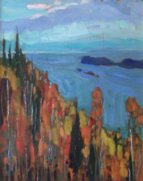
I was working on a painting and started to notice that my eye always seemed to go to a focal point I had not really anticipated at the outset. It was a small island in a long skinny lake. The more I looked at it the more I liked the image.


It reminded me of a number of group of seven paintings. Islands, particularly small deserted islands up north intrigue people. And when scouting for images to paint - intriguing is good. I wanted to do an island painting. 

Arthur Lismer


Casson
Lawren Harris
Last week I was on Chemong lake for a couple of hours, fishing. The day was bright with a lot of heavy cloud scudding through the sky. A typical fall day when the sun can be shining in one spot and 50 yards away everything is deep in shadow. 
As I fished I watched a small island near the north end of the lake and every once and a while I took a snap of it - I really liked when the Island was in shadow and the sky behind was bright and full of moving clouds - that would be my island painting. 
I wanted to do something different so I cropped my island painting into a square and made it fill the picture - I did do something very typical of the group's work - I flattened the picture out  - keeping the background as intense as the foreground. I really wanted to create high contrast - almost a sillohette.

Here's the picture in stages on the easel.


Wednesday, September 22, 2010

Blue about fall?


A few thoughts about painting fall... As the summer closes and the leaves change, the quality of light is also changing. It is a really interesting time to paint. This season requires a change in approach. I have never been a big fan of pictures of fall leaves - canvases filled with reds, oranges, yellows. Over time I have begun to understand that painting fall is more about blue. That may seem odd but one of the keys to painting good pictures is contrast and that one way to achieve this is through the use of contrasting colours. So the contrast of all the warm colours of fall is the blues. A lot of blue and a little bit of orange - makes the orange glow - just look at some of the impressionists paintings of oranges - they are often placed on big blue backgrounds. And the proportions need to be well thought out as well. Equal amounts of contrasting colour makes for a very unexciting outcome. So in my newest series of fall sketches I am using touches of orange and reds but lots of blues. You can judge the success of painting fall, with blue.