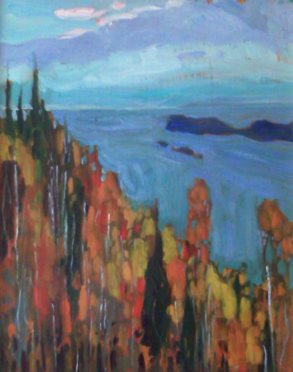
A few thoughts about painting fall... As the summer closes and the leaves change, the quality of light is also changing. It is a really interesting time to paint. This season requires a change in approach. I have never been a big fan of pictures of fall leaves - canvases filled with reds, oranges, yellows. Over time I have begun to understand that painting fall is more about blue. That may seem odd but one of the keys to painting good pictures is contrast and that one way to achieve this is through the use of contrasting colours. So the contrast of all the warm colours of fall is the blues. A lot of blue and a little bit of orange - makes the orange glow - just look at some of the impressionists paintings of oranges - they are often placed on big blue backgrounds. And the proportions need to be well thought out as well. Equal amounts of contrasting colour makes for a very unexciting outcome. So in my newest series of fall sketches I am using touches of orange and reds but lots of blues. You can judge the success of painting fall, with blue.


No comments:
Post a Comment